Portfolio

Website Development

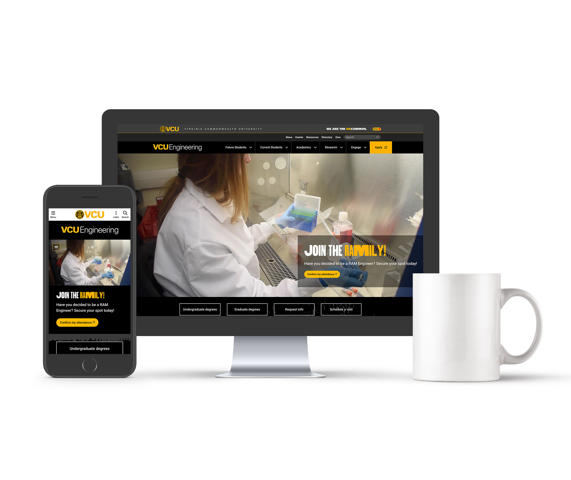
VCU College of Engineeringlive

This website uses a proprietary framework that I've molded and shaped to achieve the current front-end design. The content management systems allows for creating custom page layout and content types.

visit website

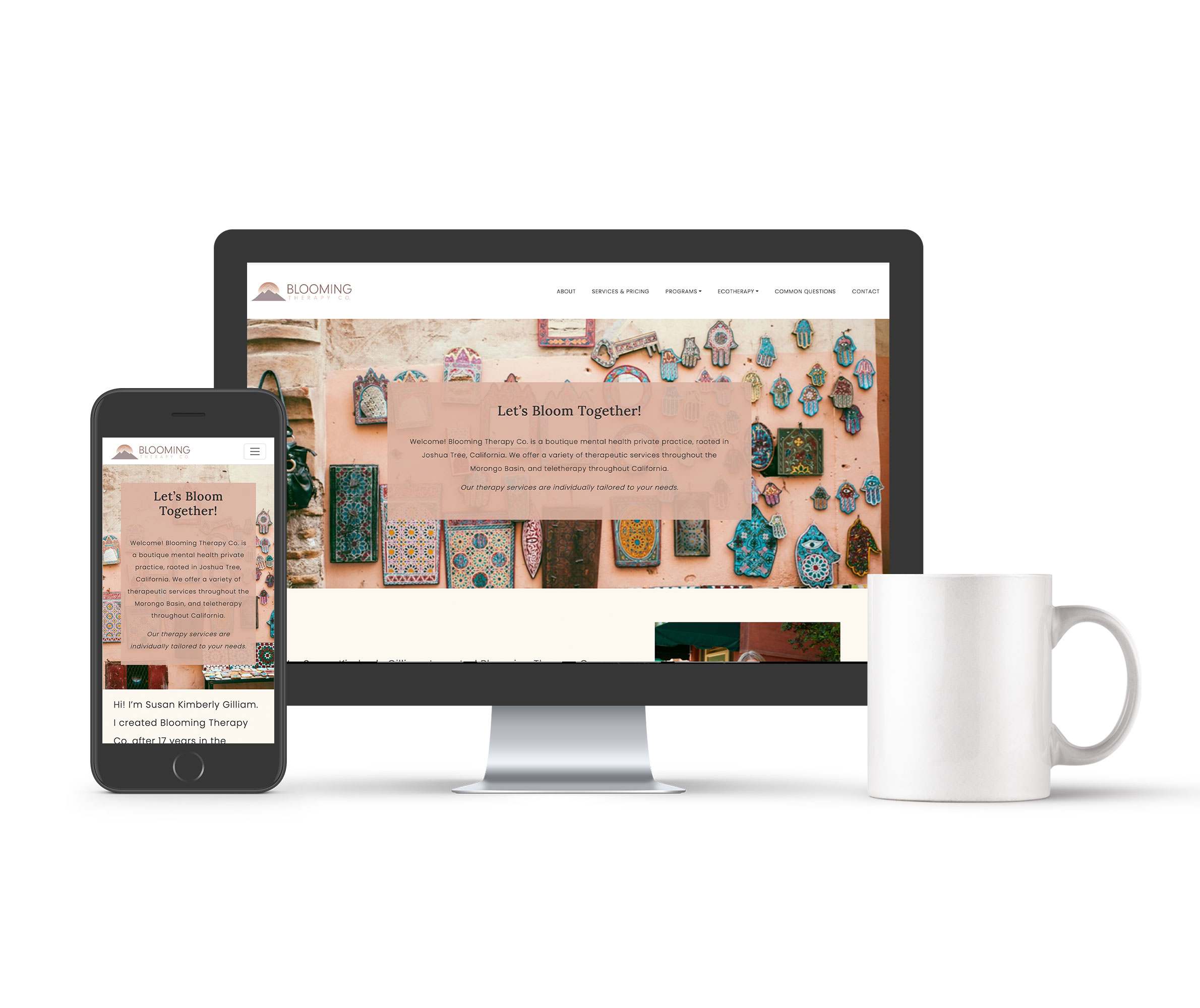
Blooming Therapy Co.live

This website uses Wordpress as the content management system even though there is currently no blog component. This project was handed off to the client to maintain the content and much of the original design remains in tact.

visit website

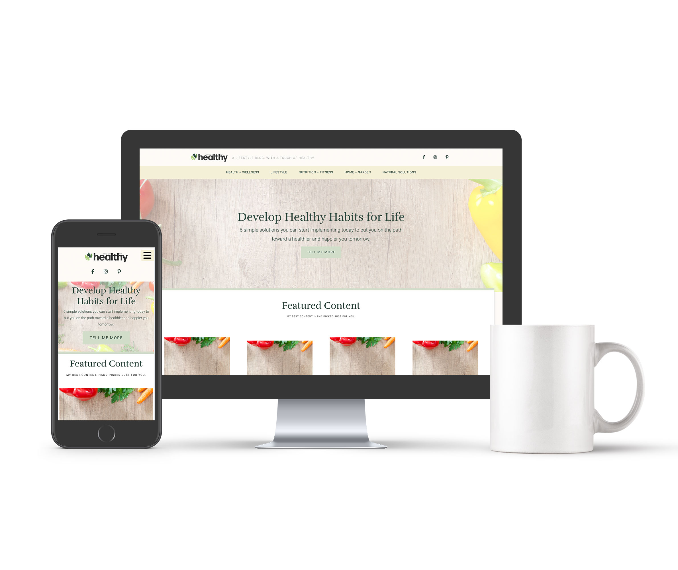
Touch of Healthytemplate

A health and wellness blog template developed for Wordpress. This website is no longer live, but you can take a look at the original design as it was first implemented when the blog was launched.

view template

Logo Design

Click on any of the images below to learn more about the project.

Blooming Therapy Co.

Type: Logo design
Vibes: Rustic, warm, inviting, feminine

Blooming Therapy Co. is a small business based out of California that specializes in various forms of in-home therapy. The client wanted something rustic and warm while also being slighlty feminine as their target audience is mostly women. Inspriation was drawn from the mountains and deserts in the region and a rose design was added to play off the "blooming" aspect of their business.

Small World of Destrehan

Type: Logo design
Vibes: Childish, friendly, playful, fun

Small World of Destrehan is a small buisness in Louisiana that specializes in early childhood education (i.e. daycare). The client wanted something friendly and playful that was a representation of their business but also their clientel (babies and toddlers). You'll notice the "small world" in between the children that speaks to the brand name.

Touch of Healthy

Type: Logo design
Vibes: Bright, green, clean, relateable

Touch of Healthy was a health and wellness blog I created as part of a person project. Things shifted in my life and I eventually moved away from the blog, but I wanted to create something that gave those health and wellness vibes. You can also view the website template I created here.

Rhythm Ranch Homestead

Type: Logo design
Vibes: Rustic, Farmhouse, Simple, Whimsical

Rythm Ranch Homestead is a small family farm in Virginia that is owned an operated by a musician (hence the name "Rhythm Ranch"). The client wanted to have both their musical background as well as their passion for animals represented in the logo. You'll notice the music notes in the design as well as he goat and chicken – two of the primary animals found at this farm.

Spines at the Line Chiropractic Center, LLC

Type: Logo design
Vibes: Professional, unique, strong, play-on-words

As the name suggests, Spines at the Line Chiropractic Center, LLC, is a small chiropractic business that is close to the boder between Ohio and Michigan. Lots of literal elements in this design, but that was at the client's request. They wanted it to be obvious who they, where they are and what they do.

SJ Kreations

Type: Logo design
Vibes: Rustic, Distressed, Farmhouse, Simple

SJ Kreations was a small business in Virginia that specialized in (you guessed it 😜) hadmade crafts and upcycled products. Most of the products they created had more of a rustic and farmhouse vibe to them, which was what the client was looking for in their logo.

Graphic Design

Click on any of the images below to learn more about the project.

St. Charles Borromeo

Type: Graphic design
Vibes: Retro, nostalgic, functional, religious

This design was created for a local church as part of their 300th anniversary. The client held a design challenge where anyone could contribute their ideas and designs. While this design was not selected, they used parts of it to create the final product.

Bonnabel "Bruins" Reunion

Type: Merchandise design
Vibes: Collegiate, bold, on-brand, fun

This design was created for a local high school reunion. The client wanted something that represented the brand colors and identity of the school while also having a collegiate look and feel. The design was used on t-shirts, tumblers and other merchandise.